Title Design
For my title I plan on using 2 or 3 fonts, depending on how they will look in the final product. I am leaning towards a simple font that matches the mood and atmosphere. In my opinion, having an extreme font only works well in certain situations and distracts the viewer in a normal situation. Even for my broad title, I want to it match a calm mood and fit well into a night time atmosphere. I plan to use a simple dark grey for lighter backgrounds and white if I ever show a title during the night. Each title will show for about 3 seconds. The words on the title will subtly fade in and fade out on the screen.
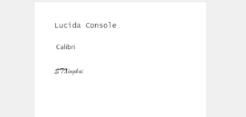
A tentative title for this film would be "Writer's Block". I hope to use the font called, STXingkai. It is a little complicated, but leaves an intriguing effect for the title. My hope is that is piques the viewer's interest.
For the titles other than the "Directed by:", I will use the font "Calibri" or "Lucida Console". I feel that this is a standard font that does not have many sharp edges that will make it difficult to film. Especially the latter, which I feel has its own unique aesthetic.
I still don't know where I can put some of the credits. I might put some as something the writer is making or typing. This might be hard to execute on paper, but may be possible on the computer. Footsteps can also transition between credits, especially shots with low light. I can use white or lighter colors and have more versatility. With this, I could use more bizarre colors such as mint or vermilion.


Comments
Post a Comment