Title Design
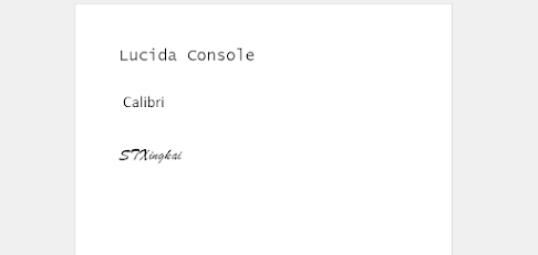
For my title I plan on using 2 or 3 fonts, depending on how they will look in the final product. I am leaning towards a simple font that matches the mood and atmosphere. In my opinion, having an extreme font only works well in certain situations and distracts the viewer in a normal situation. Even for my broad title, I want to it match a calm mood and fit well into a night time atmosphere. I plan to use a simple dark grey for lighter backgrounds and white if I ever show a title during the night. Each title will show for about 3 seconds. The words on the title will subtly fade in and fade out on the screen. A tentative title for this film would be "Writer's Block". I hope to use the font called, STXingkai. It is a little complicated, but leaves an intriguing effect for the title. My hope is that is piques the viewer's interest. For the titles other than the "Directed by:", I will use the font "Calibri" or "Lucida Console". I feel that t...
